top of page
CONCHA Y TORO

FRONTERA
Fontera Wine
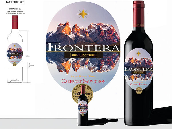
The Brief here was to reinvent the type face and logo for the Chilean wine house Concho Y Toros's FRONTERA, meaning Frontier, in particular their Cabernet Sauvignon.
Experimenting with the most famous Chilean Mountain Range, reflecting it, as in a lakes view in wilderness, having a Grape Shape label, also placing the Star emblem center and above the type face, creating a new F that occupies an 'over ridged' design on the R, then adding the Concha Y Toro's logo mid centre.
I believed Justice had been done to the revamping of their old look.
Cheers !!!
bottom of page